How BetterUtils Simplifies Responsive Design for Developers
Cut the busywork out of responsive design. Free aspect ratio, image compression and contrast tools that help you ship layouts holding up on any screen.
Responsive design stopped being a specialty years ago. Most developers have the fundamentals down: fluid grids, flexible images, media queries, a mobile-first mindset. The CSS is rarely the hard part.
What eats the day is everything around the CSS. You need a hero image at exactly 16:9 for desktop and 4:5 for mobile. You need it under 200 KB so it does not wreck your Largest Contentful Paint score. You need to confirm a new accent color clears 4.5:1 against the card background before a reviewer flags it.
Each of these is a two-minute job that becomes fifteen once you open a design application and hunt through menus. This guide walks through where responsive workflows actually leak time, and which free browser-based tools close the gap.
Where Responsive Work Actually Slows Down
In practice, responsive problems cluster into four groups, and almost none of them are media query problems. The first is dimension guesswork: a designer hands over a 2560 by 1080 hero, you need the mobile variant, and you end up doing ratio arithmetic in your head and getting it slightly wrong.
The second is asset weight, because an uncompressed hero image on a mobile connection is the most reliable way to fail a performance audit. The third is contrast failures that only appear at certain breakpoints, since a color pair that passes on a light desktop card can fail badly inside a dark mobile drawer.
The fourth is palette drift, where several developers pick close-enough hex values across components until the design system has four slightly different blues and nobody knows which one is canonical. Each has a fast fix.
- Dimension guesswork - ratio maths done by hand, discovered as a squashed image on a real device
- Asset weight - oversized images dominating your Largest Contentful Paint measurement
- Contrast failures - color pairs that only break in a specific responsive context
- Palette drift - near-identical values multiplying across components over months
Locking Down Aspect Ratios Before You Write CSS
Aspect ratio is the foundation of predictable responsive imagery. Once you know the ratio you are targeting, the CSS aspect-ratio property handles the rest and prevents layout shift entirely, because the browser reserves the correct space before the image loads.
Google treats Cumulative Layout Shift as a Core Web Vital, and unreserved image space is one of its most common causes. The awkward part is arriving at the right numbers. If you have a 1920 by 1080 source and need the height for a 768px-wide container, that is a calculation you should not be doing thirty times a sprint.
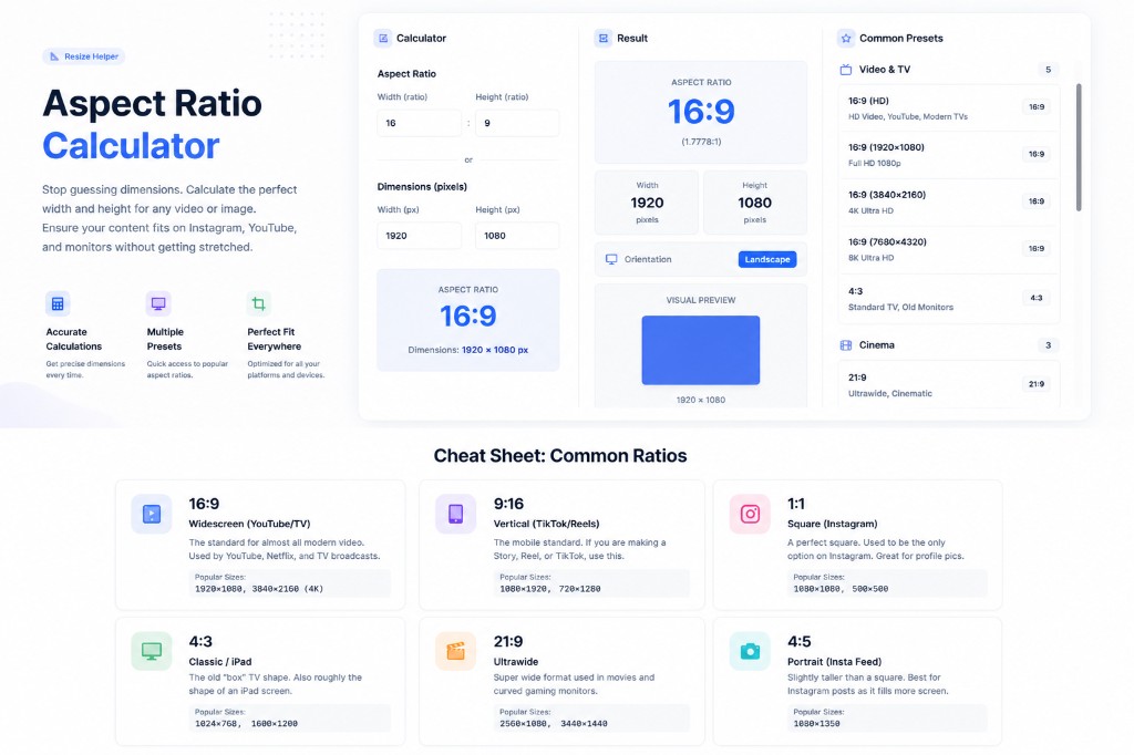
The Aspect Ratio Calculator takes your source dimensions and a target width and returns the exact height, with presets for common formats like 16:9 and 9:16. Enter 1920 by 1080, set the new width to 768, and you get 432 immediately.
Turning those numbers into markup
Once the values exist, your picture element writes itself. Set explicit width and height attributes on every source, which is what actually eliminates layout shift, and let srcset pick the right file per viewport.
MDN's responsive images guide covers the sizes attribute in detail, and it is worth reading properly rather than copying a snippet, because a wrong sizes value silently makes the browser download the largest file on every device.
| Breakpoint | Container width | Ratio | Computed height |
|---|---|---|---|
| Mobile | 640px | 4:5 | 800px |
| Tablet | 1024px | 16:9 | 576px |
| Desktop | 1920px | 16:9 | 1080px |
Resizing and Compressing Without Leaving the Browser
Image weight is where responsive performance is won or lost. A page that serves the same large image to a phone and a desktop is not responsive in any meaningful sense, no matter how good the CSS is. Since the LCP element is most often an image, this is usually the highest-leverage fix available to you.
The order of operations matters more than people expect. Use the Image Resizer first to generate each breakpoint variant, then run each variant through the Image Compressor. Compressing a 2560px file and downscaling it afterwards throws away the compression work and can introduce visible artifacts.
For photographic content, a quality setting around 80 percent is usually indistinguishable from the original while cutting file size substantially. If you are moving to modern formats, the Image Format Converter handles WebP, which typically produces meaningfully smaller files than an equivalently compressed JPEG.
Serve WebP with a JPEG fallback inside a picture element and browsers that do not support it simply ignore the WebP source. For small icons above the fold, the Image to Base64 converter lets you inline an asset into your CSS and remove a network request, though base64 adds roughly a third to the encoded size, so this only pays off on genuinely tiny files.
Checking Contrast at Every Breakpoint
Accessibility failures caught in review are expensive, and failures caught in an audit are worse. Both are avoidable with a thirty-second check. The Contrast Checker takes a foreground and background value and returns the ratio along with pass or fail status.
The thresholds come from the W3C's WCAG 2.1 guidance: 4.5:1 for normal body text at AA, 3:1 for large text, 7:1 for body text at the enhanced AAA level, and 3:1 for interface components and meaningful graphics.
The responsive detail most people miss
Contrast is not a property of your palette. It is a property of each specific foreground and background pair, and responsive layouts create pairs you never planned for. Your muted gray body text might clear 4.5:1 on the white desktop background and fail on the tinted card that only appears below 768px.
Build a small matrix of every real combination in your interface, including hover and disabled states, and check them all once. It takes ten minutes and never needs repeating.
Keeping Colors Consistent Across Components
Color drift is a slow problem. It breaks nothing on day one, it just makes the codebase progressively harder to reason about. The Color Palette Generator builds a coherent set from a single base color, which is useful when you are establishing tokens for a new component library.
The Color Converter handles HEX, RGB and HSL translation, and HSL is genuinely worth adopting for responsive theming, because generating a hover state becomes a matter of nudging one lightness value rather than guessing at a new hex.
If you are matching a design comp or an existing brand asset, the Image Color Extractor pulls dominant colors straight out of a screenshot so you get exact values instead of eyeballing them, and the Color Picker covers the one-off lookups.
For background treatments the Gradient Generator outputs copy-ready CSS, with one caveat worth stating: a gradient line scales with its element, so a diagonal gradient that looks balanced on a wide desktop hero can compress into something harsh on a narrow mobile container. Check it at your actual breakpoints rather than assuming it travels.
Validating the Config and Metadata Around Your Layout
Responsive work touches more than CSS. If your breakpoints and design tokens live in a JSON theme file, run it through the JSON Validator before committing, because a trailing comma in a config file is a frustrating way to lose twenty minutes on a red build.
The JSON Formatter is useful when you inherit a minified token file and need to read it, and the JSON Minifier trims the version you actually ship.
Social preview images deserve the same attention as in-page assets, since they are frequently the largest file associated with a page and they are governed by their own ratio rules. The Open Graph Checker shows you how a URL will actually render when shared, which catches the common case of an OG image that is either missing or cropped badly at 1.91:1.
A Realistic Pre-Ship Checklist
Here is the sequence worth running before shipping any responsive component. None of it is difficult. The value is in each step being fast enough that you actually do it every time, rather than only after something has already gone wrong in production.
- Run your source dimensions through the Aspect Ratio Calculator for every breakpoint and write the numbers down
- Resize to each target width first, then compress - never the other way round
- Convert to WebP with a JPEG or PNG fallback in a picture element
- Put explicit width and height attributes on every image element to reserve layout space
- Check every foreground and background pair in the Contrast Checker, including states that only appear on mobile
- Validate any JSON config holding your breakpoints or tokens before you commit it
- Confirm the social preview renders correctly with the Open Graph Checker
Why Browser-Based Tools Fit This Workflow
There is a practical argument for client-side utilities beyond convenience. When compression and conversion happen in your browser, the image never touches a server.
For teams working on unreleased products, client work under a non-disclosure agreement, or anything involving user-supplied content, that distinction matters, and it removes an entire category of conversation with your security team.
It also means the tools keep working once loaded, with no account to manage and no rate limit to hit on a busy afternoon. For a task you perform dozens of times a week, that reduction in friction compounds.
The honest limitation is worth stating too: browser-based tools process one file at a time, so if you are optimizing several hundred assets in a build pipeline you want a build-step plugin rather than a web tool.
For the everyday case of preparing a handful of images for a component, a browser tool is faster than anything you would set up locally.
Frequently Asked Questions
Does compressing images actually improve SEO rankings?
Indirectly. Page experience signals including Core Web Vitals are a ranking factor, and image weight is usually the dominant contributor to Largest Contentful Paint. Compression alone will not outrank stronger content, but slow pages do lose ground over time. Treat it as removing a handicap rather than gaining an advantage.
What image quality setting should I use?
Start at around 80 percent for photographs and judge it visually against the original. Most people cannot tell the difference on screen, and the file size saving is substantial. Illustrations and screenshots with flat color areas tolerate more aggressive settings, but anything containing fine text should be checked closely before you commit to it.
Should I use WebP or stay with JPEG?
Serve WebP with a JPEG fallback inside a picture element. WebP gives you smaller files at equivalent visual quality, and the fallback costs nothing because browsers that support WebP ignore the fallback source entirely. You get the benefit without taking on any compatibility risk.
How should I choose my breakpoints?
Base them on where your content breaks, not on specific device widths. Widen your browser from mobile size and note where the layout starts looking wrong - that is your breakpoint. Device-specific breakpoints go stale as hardware changes, while content-driven ones stay valid.
Is 4.5:1 contrast good enough?
It meets WCAG AA, which is the level most organizations target and most accessibility regulations reference. If your audience skews older or your product gets used outdoors in variable light, aiming for the AAA threshold of 7:1 on body text is a reasonable and fairly cheap upgrade.
Conclusion
Responsive design is rarely blocked by hard problems. It is blocked by an accumulation of small ones: a ratio you have to work out, an image you have to compress, a contrast pair you have to verify, a config file you have to check. Individually trivial, collectively a real drag on a sprint.
The fix is having the right tool one tab away and reachable in seconds. Start with the Aspect Ratio Calculator below, or browse the full set of free BetterUtils tools - everything runs in your browser, and nothing requires an account.
Sources & further reading
Tools mentioned in this guide
Ready to try it yourself?
Use our free tool to get started right away. No signup required!
Try the Tool Now →Related reading
- Aspect Ratio Guide: Images & Videos (16:9, 4:3, 1:1)
Master aspect ratios for perfect images and videos. Learn about 16:9, 4:3, 1:1, and more. Essential guide for content creators and designers.
- Image Compressor Guide: Reduce File Size Without Losing Quality
Learn how an image compressor works, the difference between lossy and lossless compression, and how to reduce image file size for faster websites and easier sharing.
- Color Palette Generator: Create Beautiful Color Schemes for Any Project
Learn how to use a color palette generator to create harmonious color schemes for web design, branding, art, and more. Includes color theory basics and practical tips.
- JSON Formatter: How to Format, Validate & Beautify JSON Online
A complete guide to using a JSON formatter — how to beautify minified JSON, validate syntax, understand common errors, and work with JSON in APIs and web development.