Boost Your Social Media Presence with Free Text and Image Tools
Grow your reach without a design budget. Free font generators, bio builders, image resizers and QR tools that make your social posts stop the scroll.
Most advice about growing a social media presence quietly assumes you have a budget. Buy the scheduler, buy the design subscription, buy the analytics platform. That advice is fine if you have the money and useless if you do not.
Here is the part worth saying plainly: the tools are rarely what separates accounts that grow from accounts that stall. Consistency, a clear point of view, and posts that stay legible in a fast-scrolling feed do most of the work, and all three are achievable with free browser-based utilities.
This guide covers a working system - how to make your text visually distinct without breaking accessibility, how to write a profile that converts visitors into followers, how to size images correctly per platform, and how to make your single bio link do more than one job.
Why Visual Differentiation Works in a Feed
The average social feed is a wall of near-identical formatting. Same system font, same weight, same spacing. Anything that breaks that pattern earns a fraction of a second more attention, and a fraction of a second is often the entire decision window.
This is not about being flashy, it is about hierarchy. A caption where the hook is visually distinct from the body is easier to parse at scroll speed than a uniform block of text. Since platforms do not give you bold or italic in captions, the workaround is Unicode characters that render as styled text.
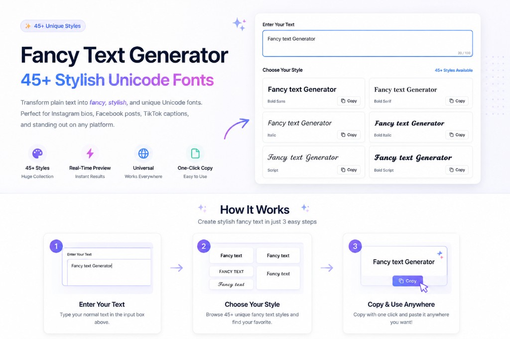
That is what a Fancy Text Generator does - you type normally and it returns the same string in variants that most platforms display as bold, italic, script or decorative styles. Because these are characters rather than formatting, they survive being pasted anywhere.
Picking the Right Generator for Each Platform
Each platform has its own quirks in how it renders and truncates styled text, so BetterUtils keeps platform-specific generators rather than one general tool.
Beyond the platform set, the Aesthetic Text Generator and Symbol Generator cover decorative dividers, while the Small Caps Generator and Bold Text Generator handle the subtler end where you want emphasis without the post looking like a ransom note.
- Instagram Fonts - bios and captions
- TikTok Font Generator - captions and on-screen text
- Facebook Fonts Generator - posts and page descriptions
- Twitter Font Generator - threads and pinned posts
- Discord Font Generator - server announcements and channel names
- Emoji Text Generator - emoji-styled lettering for headers
The Accessibility Rule Most Guides Skip
This matters and almost nobody mentions it. Screen readers announce Unicode styled characters individually and often nonsensically, so a word set in mathematical bold script can be read aloud as a string of unrelated character names.
The W3C's guidance on non-text content is clear that content has to be perceivable to assistive technology, and styled Unicode frequently is not. The practical rule is simple: use styled fonts for accent, never for substance.
A decorative divider, a single emphasized word, your name in a bio - all fine. Your entire caption, your call to action, or any information a reader actually needs - plain text. If someone using a screen reader could not understand your post with the styled text stripped out, you have overused it.
This also protects you on discoverability, because platform search indexes plain text far more reliably than Unicode variants, so a fully styled caption is often invisible to in-app search.
Writing a Bio That Actually Converts
Your bio is the highest-leverage text you will write and most people spend three minutes on it. Someone lands on your profile after seeing one post, and you have roughly 150 characters and about two seconds to answer two questions: what is this account, and why should I stay.
The Instagram Bio Generator gives you starting structures when you are staring at an empty field, but treat the output as a first draft, because the specificity has to come from you and that is the part that differentiates.
Use the Character Counter to check you are inside the limit before you paste, since bios that get truncated mid-sentence look careless.
If your preferred handle is taken, the Nickname Generator helps you find variations - and one piece of advice worth following is to prioritize handle consistency across platforms over having the perfect name on one, because being findable at the same handle everywhere compounds.
- Who you are, or who you help - one short line, as specific as you can make it
- Proof or specificity - a number, a credential, a niche detail that is hard to copy
- A single call to action - one, not three competing ones
- The link, pointing somewhere that matches what the call to action promised
Getting Image Dimensions Right
Wrong image dimensions are the most common and most fixable social media mistake. A post cropped badly in the feed, a thumbnail with the subject cut off, a story with text sitting under the interface - all of it comes from not sizing before uploading.
Use the Image Resizer to hit exact dimensions, the Image Cropper to control framing yourself rather than letting the platform decide, and the Image Compressor before you upload. That last step is worth explaining because it is counterintuitive.
Every platform re-compresses uploads. If you upload a very large file the platform compresses aggressively and the result often looks noticeably worse, whereas a well-compressed file gives the platform less work to do and usually survives with better visible quality.
For vertical 9:16 content specifically, keep anything important inside the middle 60 percent of the frame, because platform interface elements cover roughly the top and bottom fifth.
Adapting one asset across formats
When you have a single hero image and need it in four places, the Aspect Ratio Calculator works out the crop dimensions that preserve your subject rather than guessing and cutting someone's head off.
Crop first to the new ratio, then resize to the target pixel dimensions, then compress - doing it in that order keeps the subject where you intended.
| Format | Dimensions | Ratio |
|---|---|---|
| Instagram feed (portrait) | 1080 x 1350 | 4:5 |
| Instagram feed (square) | 1080 x 1080 | 1:1 |
| Stories, Reels and TikTok | 1080 x 1920 | 9:16 |
| Facebook feed | 1200 x 630 | 1.91:1 |
| X in-stream | 1600 x 900 | 16:9 |
| YouTube thumbnail | 1280 x 720 | 16:9 |
Building a Visual Identity People Recognize
Recognition beats novelty on social media. When someone sees a post in a feed and knows it is yours before reading the handle, you have won something that is genuinely difficult to buy.
The mechanism is repetition of a small number of visual decisions: two or three colors, one font pairing, one layout pattern. Pick them once and hold them.
The Color Palette Generator builds a coherent set from a base color, and keeping it to three or four is deliberate, because beyond that consistency becomes impossible to maintain across dozens of posts.
The Image Color Extractor is useful if you want to derive a palette from a photo that already represents your aesthetic.
The Contrast Checker makes sure text placed over images stays readable - a real problem on phone screens in daylight, and one that quietly costs you engagement because people scroll past what they cannot read.
If you want to push further, the Image Filters tool lets you apply a consistent treatment across a set of photos so a grid reads as one body of work.
Making Your One Link Do More Work
Most platforms give you a single clickable link. A QR Code Generator extends its reach into contexts a link cannot reach - a story slide, a business card, a product insert, a slide in a talk.
The QR Code with Logo version lets you brand it, which improves scan rates in practice because a branded code reads as trustworthy rather than as a random black square. If you are producing codes for several campaigns or products, the Bulk QR Generator handles them in one pass instead of one at a time.
Two practical notes. Use a distinct tracked URL per code, with different parameters at minimum, otherwise you cannot tell which placement is working and the data is useless.
And always scan your own code with an actual phone before publishing, ideally at the size it will be printed or displayed - the QR Code Reader is a fast desk check, but a code that fails at real-world size is a completely wasted placement and nobody will tell you.
A Weekly Batching Workflow
Consistency is what actually drives growth, and consistency comes from batching rather than from motivation. The whole cycle below takes roughly two hours a week once you have the rhythm, and its real value is removing the daily decision of what to post, which is the thing that quietly kills most posting schedules.
Use the Word Counter while drafting if you are writing longer captions, and the Remove Text Formatting tool when you are pasting from a document and do not want stray formatting characters travelling with the text.
- Monday - plan. Decide the week's posts and write captions in a plain document. Style nothing yet
- Tuesday - visuals. Crop, resize and compress every image for the week in one sitting, which is dramatically faster than doing it per post
- Wednesday - styling. Run captions through the font generators, applying styling only to hooks and accents, then check the plain-text version still reads correctly
- Thursday - assemble. Combine text and images, check character counts, and queue everything
- Friday - review. Look at what performed, note the pattern, and feed it into Monday's planning
Frequently Asked Questions
Do fancy fonts hurt my reach or engagement?
There is no evidence that platforms penalize Unicode text directly. The real risk is indirect - heavily styled captions are harder to read, inaccessible to screen readers, and poorly indexed by in-app search. Used sparingly for emphasis they help you stand out. Used for entire captions they work against you.
Will styled fonts display correctly on every device?
Almost always on current iOS and Android. Older devices and some desktop browsers occasionally render an unsupported character as an empty box. Test on a second device before relying on a particular style for anything important, especially in a bio that stays up for months.
What image size should I use if I only make one version?
1080 by 1350, the 4:5 portrait format. It occupies the most vertical space in mobile feeds, which means more of the screen is yours as someone scrolls, and it crops down to square far more gracefully than a square crops up to portrait.
How often should I post?
Consistency beats frequency. Three posts a week sustained for months outperforms daily posting for two weeks followed by silence. Pick a cadence you can hold during a genuinely busy month rather than an ideal one, because the schedule you abandon costs you more than the modest one you keep.
Are free tools good enough for professional work?
For text styling, image resizing, compression, cropping, palette generation and QR codes, yes. Paid platforms earn their cost through team collaboration, shared asset libraries and scheduling at scale. The output quality on the specific tasks covered in this guide is not meaningfully different.
Conclusion
A social presence is built from repeated small decisions executed consistently, not from an expensive tool stack. Distinct but readable text, a bio that answers the obvious question in two seconds, correctly sized images, a coherent palette, and a link that goes somewhere useful - that is most of it.
Every tool referenced in this guide is free, runs entirely in your browser, and needs no account. Start with the Fancy Text Generator below, or work through the image tools if your visuals are the weaker half.
Sources & further reading
Tools mentioned in this guide
Ready to try it yourself?
Use our free tool to get started right away. No signup required!
Try the Tool Now →Related reading
- Aesthetic Instagram Bio Ideas & Font Tips
Transform your Instagram bio with aesthetic fonts and creative layout ideas. Tips for influencers and brands.
- TikTok Caption Hacks: How to Get Viral Fonts
Stop the scroll with unique TikTok fonts. Learn how to use bold and aesthetic text in your TikTok captions and username.
- Fancy Text Generator: 45+ Stylish Unicode Fonts for Social Media
Discover how to use a fancy text generator to create 45+ stylish Unicode fonts for Instagram, Twitter, Discord, and more. Complete guide with tips and tricks.
- QR Code Generator: How to Create Free QR Codes for Any Use
Learn everything about QR codes — how to create them with a free QR code generator, best use cases, design tips, and how to track scan performance.